Color is the heartbeat of a home. It’s the first thing you notice when you walk into a room and the quiet force that shapes how you feel within it. A well-chosen color palette can turn a house into a sanctuary—lifting your mood, reflecting your personality, and tying every corner together in harmony. But with endless shades to choose from, picking the perfect palette can feel daunting. Where do you start? How do you make it work?
This article is your guide to mastering color in décor. We’ll explore how colors influence your space, break down the steps to crafting a palette, and share insider tips to bring your vision to life. Whether you’re refreshing a single room or reimagining your entire home, these strategies will help you choose colors with confidence and creativity. Let’s dive into the world of color and transform your home, one hue at a time!

Why Color Matters in Your Home
Color isn’t just decoration—it’s a tool. It sets the tone, defines the mood, and even alters how a space feels physically. A bright yellow might energize a kitchen, while a soft blue soothes a bedroom. Beyond aesthetics, colors can make a small room feel airy or a large one cozy. They’re the threads that weave your décor into a story—your story.
Understanding this power is the first step to choosing wisely. A perfect palette doesn’t just look good; it feels right for you and your lifestyle. So, how do you find it? Let’s start with the basics.
Step 1: Understand the Psychology of Color
Colors speak to us, often in ways we don’t consciously notice. Knowing their emotional impact helps you pick a palette with purpose.
What Colors Say
-
- Red: Bold and passionate, it sparks energy but can overwhelm if overused. Great for accents or social spaces.
-
- Blue: Calm and serene, it’s a go-to for relaxation—think bedrooms or bathrooms.
-
- Yellow: Cheerful and warm, it brightens moods but can feel intense in large doses.
-
- Green: Balanced and fresh, it connects to nature, making it versatile for any room.
-
- Neutrals (White, Gray, Beige): Timeless and flexible, they ground a space and let other hues shine.
How to Use It
Ask yourself: How do I want this room to feel? Energized? Peaceful? Cozy? Match the mood to the color’s vibe, and you’re on your way.
Step 2: Start with Inspiration
A palette needs a spark—something to guide your choices. Inspiration is your launchpad.
Where to Look
-
- Your Life: A favorite scarf, a piece of art, or a photo from a trip can kickstart your palette. Pull out the key colors.
-
- Nature: Think earthy greens from a forest or soft corals from a sunset. Nature’s combos rarely clash.
-
- Existing Pieces: Love your sofa or rug? Use its tones as your anchor.
Pro Tip
Snap a photo of your inspiration and break it into three parts: a dominant color (60% of the room), a secondary color (30%), and an accent (10%). This 60-30-10 rule keeps things balanced.
Step 3: Build Your Palette with the Color Wheel
The color wheel is your cheat sheet for harmony. It’s not just for artists—it’s a practical tool for décor.
Key Concepts
-
- Complementary: Colors opposite each other (blue and orange) pop with contrast. Use one as the main hue, the other as an accent.
-
- Analogous: Colors next to each other (blue, teal, green) flow smoothly, creating a calm, cohesive look.
-
- Monochromatic: Variations of one color (light blue, navy, sky) offer depth without chaos.
How to Apply It
Pick a base color you love, then use the wheel to find its partners. For example, a warm beige base could pair with analogous terracotta and mustard, or complementary teal for a bold twist.
Step 4: Test Your Colors in Real Life
A color on a swatch isn’t the same as a color on your wall. Testing is where theory meets reality.
Why It’s Crucial
Lighting changes everything—natural light shifts throughout the day, and artificial bulbs cast warm or cool tones. A color that looks perfect in the store might surprise you at home.
How to Test
-
- Sample Paint: Buy small cans and paint 2×2-foot patches on your walls. Live with them for a few days.
-
- Check All Angles: Look at them in morning light, evening glow, and under your room’s bulbs.
-
- Pair with Décor: Hold fabric or furniture pieces next to the patches to see how they play together.
If it feels off, tweak it—colors should sing in your space, not scream.
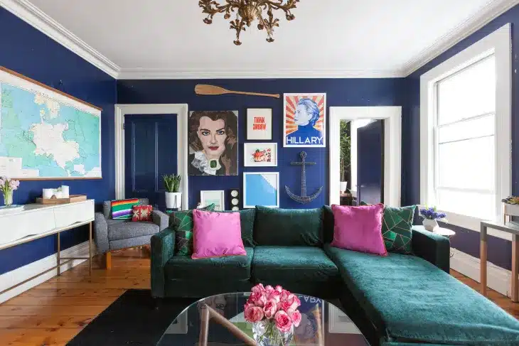
Step 5: Balance and Layer Your Palette
A perfect palette isn’t just about picking colors—it’s about using them wisely.
The Balance Act
-
- Walls: Your dominant color sets the stage. Keep it soft if you want flexibility, bold if you’re making a statement.
-
- Furniture: The secondary color ties in larger pieces like sofas or rugs.
-
- Accents: Pop your accent color in small doses—pillows, art, or a vase—to add energy without overpowering.
Layering Tricks
-
- Texture: Mix matte walls with glossy trims or woven fabrics to add depth.
-
- Patterns: Stripes or florals in your palette tie the room together—just keep scale varied (big patterns on rugs, small on cushions).
-
- Neutrals: Use them as a buffer if your palette feels too loud.
This layering keeps your space dynamic yet unified.
Overcoming Common Color Challenges
Color choices can trip you up—here’s how to handle them:
-
- Small Rooms: Light colors (pale blue, cream) make them feel bigger; add a bright accent for personality.
-
- Too Much White: Warm it up with earthy tones like taupe or soft coral.
-
- Clashing Tastes: If you and a partner disagree, blend your picks with a neutral base and shared accents.
With these fixes, your palette will work no matter the hurdle.
The Power of Your Perfect Palette
A thoughtfully chosen color palette does more than decorate—it transforms. It welcomes you home, reflects who you are, and shifts the energy of every room. When colors flow together, they create a space that’s not just beautiful but alive with intention.

Paint Your Story
Choosing the perfect palette is an adventure—one that starts with a single hue and ends with a home you love. Begin small: pick a room, find your inspiration, and play with the wheel. Test, tweak, and layer until it feels like you. Your home is your canvas—fill it with colors that speak to your soul. What shade will you start with?